Highlighted Text Expressions
I recently undertook a project at work that presented a very unique challenge. We utilize Digital Signage where I work. One of the forms of media we run is shortened versions of our more long form pieces. My co-worker is a wizard with making short, attention grabbing videos, but she is not as well-versed in After Effects. So I help her by creating templated items in the form of Adobe .mogrt files that anyone in the office can use to place over the shortened videos. These include captions, title cards, and lower thirds for the most part, but we also wanted a uniform call out template that could be utilized on every video to call on important facts and phrases that might not be said in the audio. That is where this particular journey began.
The first build I made was fairly simple. We used the Bebas font family and maintained that every character would be a capital letter for readability on lobby televisions throughout the state. I merely set up my first generation expression to have a stroke width wide enough to encase all of the letters of the alphabet and set up every individual highlight to be moveable and scalable to the text that was necessary to be highlighted. It worked wonderfully! For almost everything, at least.

See, the issue was that this particular set up didn’t allow for anything that broke the textbox to be encased in the highlighted area. So things like commas and J’s would hang outside of the highlight and nothing was being told to calculate for this particular anomaly. Now, a somewhat easy fix to this would be to limit the use of commas in a given phrase or sentence, but that is asking a bit much considering that the letter “J” would cause the very same issue and might be harder to avoid.
I desperately wanted to continue the use of individual highlights. I liked the way it looked and it was a way to call attention to any word or phrase in the text no matter where it wound up. So, I decided that the best way to build the template was to build an expression that took the bottom of the textbox above it into account when placing the position of the following textbox. It. Was. Chaos.

My first task was to get the second line to respond organically to the textbox above it. What is important to note here is that it worked, but it didn’t work easily. See, for this particular expression I had to specify each and every time the text would go outside of a certain height and tell it to adjust its position accordingly. The code looked something like this:

Yeah… I was not that thrilled with this. In fact it got a lot worse before it got better because in order to have the third line of text react correctly, I had to have it take into account the heights of both textboxes and adjust from there. That monstrosity looked a little something like this:

That is not to mention the if/else statements I had to generate to accommodate all of these calculations:


All in all, these calculations would ultimately work, but they were so cumbersome that After Effects actually started to slow down on me. It just wasn’t feasible to calculate everything from the top line.
Fine, then I would calculate everything from the middle line. “Ha! I am far too clever for After Effects to get the better of me!” is something I would say if this was a good idea. Unfortunately, I ran into a lot of the same issues with mounds of if/else statements and very specific examples. I did eventually get something that worked, but there was a caveat to that as well.
See, I spent a lot of time editing the phrase “text goes here”. Utilizing capital letters as the font we were using was all capital letters, I tagged a “J” and an end quotation mark on the end of the phrase to calculate the maximum height of the text at any one time. I figured every low hanging part of the text would be uniform and I was sorely mistaken. In Bebas Neue, the comma actually hangs lower than the J by about 3 pixels. Well, because my expression was such that it only dealt with specific values of the textbox height, it broke everything. Not to mention the fact that I had so many position expressions by this point that I couldn’t properly animate the call out like we initially planned.
This was driving me nuts. I knew what I had to do, but I just couldn’t make the expression work properly. I was getting very discouraged, but I also knew that I was getting closer every time. Even though it felt like I had made no progress, I really had just discovered several ways not to do something.
Understanding how Edison felt, I walked away from the project for the weekend and approached it an entirely new way the following week. What I needed to do was specify to the textboxes that they should always maintain an 8 pixel distance from one another. I decided to still use the middle line as my base for the expression and I built it out from there.
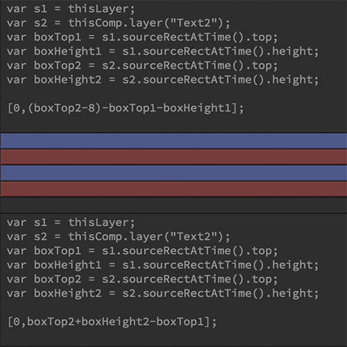
So I began with the bottom line. I told it to take its position from the bottom of the middle line (variables boxTop1 and boxHeight1 added together). I needed it to move in a negative direction whenever it grew in height, so I specified that it should subtract it’s own top (thisLayer.sourceRectAtTime().top) from the boxTop1+boxHeight1. The result worked. Whenever the bottom line of text grew or shrank, it maintained it’s distance from the middle line. I then adjusted its anchorPoint to give me the necessary distance between the highlights. I double-checked with the middle line, as well. It worked like a charm and I was frankly amazed at how little code I actually needed to accomplish what had taken me so many hours of meticulous measuring before.

The top line was a little more complicated in that I tried to do more than necessary. I tried to utilize the ease of subtracting the boxTop of the top line to make it do the math for me. What proved to be a challenge was the fact that everything the bottom line did, the top needed to do the opposite. So instead of moving down when it grew in size, it had to shift up. Ultimately, I decided to tell the top line to take the top of the middle line (thisComp.layer(“Text2”).sourceRectAtTime().top) and move upwards 8 pixels by subtracting 8 from it. It would then subtract the boxTop and the boxHeight of the top line to move into position. This worked the same as the bottom line.

Now every line can move to accommodate all the characters in the font family. Here is a video of it in action:
I animated the lines in, gave it a white text version, allowed the user to control the highlight color, scaling, positioning and visibility. The rest of the expressions I used were basic checkbox and slider controls. These are fairly simple, but tying everything to work together proved an interesting challenge. It definitely took a lot less long to make those work than the original template, but it was well worth it. This template will never have to be edited in its original form and it is very user friendly for any and everyone in the office who want to use it. They just have to pull it into their Premiere Essential Graphics panel and drop it where they need to. I also made a left and right justified version.
I learned a lot during this project and hopefully can tackle my next project all the more expertly–and quickly–thanks to the struggles I faced along the way.
